Also, another conventional music video is 50 cent’s ‘Candy Shop’ it is of the hip hop genre and without seeing the video you would know it may contain; women, cars and the rapper himself:
Our video is of the acoustic genre and therefore has distinctive conventions, such as; often more of narrative and unconventional media techniques for example, stop motion animation. This technique in particular inspired parts of our promo; we first saw the idea in Kate Nash’s video ‘Foundations’ where stills are put together to make a short clip, it is used more than once in Nash’s promo, often with normal household objects but it personifies them and shows them moving in close together and away just like the narrative of the song. Here are a few still showing the stop motion animation where the socks are shown to intertwine and then move apart:
We feel this is an effective technique because it is quirky and represents emotions that may be felt in the video and follows the narrative; it adds a little something extra which other videos will not have.
Other conventions for acoustic music videos may be, natural locations (hence us using the reservoir) or usual settings; such as homes, most of the mise-en-scene’s will be simple and so will the artist.
Another influential video for us was Lisa Mitchell’s ‘Neopolitan Dreams’ where she also uses stop motion animation but there is a part where a the girl is sat on her own on a bench, which we also used because it shows the feeling of isolation which the lyrics to our song give off.
At the start of our promo we did a typical performance shot with Lidia playing her acoustic guitar, we felt this kind of shot had to be featured somewhere as it is conventional and using it at the start shows instantly what kind of genre the promo is, it also gives a sense of authenticity to the artist and video.
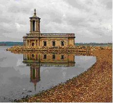
The location we chose in the end was just a 15 minute from my house and is called Rutland Water; it is a large reservoir and has loads of lovely scenery around it. One of the reasons we chose it was because it was so large and we felt we could therefore get a bit of variety from it and find some lovely areas to shoot.
Another reason we chose this location is because it reflects the feeling of isolation that Maxine’s lyrics are talking about. In our promo we used a lot of establishing shots which showed off the location, I think we could have made these shots better than they are by maybe scouting around more and finding better parts but as the weather was bad, the full potential wasn’t shown. Another conventional shot we used was close-ups of the artist which show emotion, this kind of shot is used in all types of genres videos which have a narrative because it establishes a mood and sets it for the video, in our Lidia has a tears coming down her face which I think is really effective.

The final location we used was my house, we wanted to use to some shots in a bedroom as this is common for a song based around love as its intimate, my bedroom is fairly large and has a feature wallpaper, we all agreed we could use this as a back drop for miming, rather than a simple white screen as it is almost vintage and reinforces what kind of genre the promo is. There was also other rooms in my house that we could have used and when we all got together we decided the main living room was useful because of the big sofa it had, for shots of the couple together, these shots work well as they almost act as flash backs although I think the lighting could have been improved when we shot. Another one of our locations was the small historic town of Stamford’s high street, we chose to use Stamford for our town scene because the buildings are all old and the streets wouldn’t have been too busy with people, just about as many as we needed, we also liked how the street wasn’t too wide so we could get both sides in, if we had used another high street, Peterborough for example, I think it may have looked too commercial and we may not have been able to show Lidia off as the centre of attention in shot because it would have been busier.

We kept the mise-en-scene fairly simple with Lidia most of the time, we didn’t use loads of props and simply had Lidia and her acoustic guitar, as this reinforces the genre of our music video by showing the instruments used to make the music, and the guitar is acoustic. Lidia was also clothed in an indie/vintage kind of way; she wore a cream lacey tea dress which represents how she is quite pure and vulnerable, and a vintage looking woolly cardigan which is quite quirky. The kind of clothing Lidia wears in the video is similar to what other acoustic artists such as Kate Nash and Lissie would wear so it is quite apparent that she is an acoustic artist, from feedback we received this was noted.

We used flashbacks because we wanted to make the narrative clearer and show the difference between time sin the couples relationship, a lot of music video swhich have a strong narrative about love will often use flashbacks and this is why we felt it was a good idea. On our flashback style scenes we made them black and white which shows the difference between the couples past times and then the present when Lidia is upset, I feel without changing the tones it wouldn’t have been easy to distinguish between the narrative and performance. We also added a short shot at the beginning which states the name of the song and the artist’s name, we got this from Jose Vander’s music promo where she has a similar style to us but also a picture of her, it makes it clearer to the audience and it is fairly memorable.

We also put an ‘aged film’ effect on it which makes it look like an old-fashioned film and this gives it a vintage feel which many acoustic artists go for, so it is therefore in keeping with our genre and also gives it a different edge to other genre videos, not many other music promos would add effects as I think it is a slightly old-fashioned to do but we felt it fitted in nicely. Another effect we added was to a shot of Lidia dancing where we added a ‘romantic’ effect which makes it slightly hazy and toned down which links to the love theme in the song, it also improved the shot as the scenery around wasn’t quite what we wanted as there was a lot of stone in shot. Another part of our editing was sorting out the timings for our stop motion animation, we had to make sure it kept in with other timings of the song and it was fast enough as to not get boring, the love hearts at the beginning were particularly difficult because of the guitar at the beginning as it was a problem to keep it in time, similar to in Kate Nash’s promo for Foundations, http://vimeo.com/5439604
Our promo I would say is around 50/50 narrative and performance, we did this because it is conventional and we took this idea from Steve Archer’s theory that there should always be ‘a strong and coherent relationship between narrative and performance in music promos.’ This is especially important in our video because the song lyrics themselves create a strong narrative so we thought we should show this off with scenes of the couple together, but we also felt it was important to show the artist lip syncing and playing her acoustic guitar because it is a theme through the acoustic genre that the artists are more focussed around the music rather than just becoming famous, like artists from reality TV shows such as Matt Cardle and JLS whose music isn’t authentic, we wanted to show off that Maxine has written and played all her music herself and we did this by making sure we had shots of Lidia playing and singing.

Our ancillary task is fairly conventional for an acoustic artist, we kept the girly theme throughout which all artists would do for there merchandise as it makes a clear link and something for fans to follow. Other conventions we kept to were things such as making sure images of the artists are the main focus so fans have a link to what kind of person the artist is, we showed our Maxine as a pretty, young, upcoming artist whose main focus is on her music rather than someone like Kylie; who is an established artist and is of the pop genre so wants to therefore come across as a well-known independent woman, this is shown in her images.
The cover of our digipak has a very clear link to the artist Adele’s album cover for her album ‘21’ we did this because Adele has the same kind of feeling towards music as Maxine does, it is all her own and very authentic and she is also not interested in making herself the centre of attention, just her music.

Another thing we did was keep the title really plain and didn’t even give the album a clear name just like Lissie did with hers because it makes it then just a little simpler and less of an album, more of a collection of music. We also added in on a side of our digipak information about tour dates which makes it clear to the buyer that there is a tour and therefore if they like the music, they would hopefully want to go.
On our magazine advert we put the usual information that is needed, such as tour dates and when the album is out, we also kept the theme the same and put another simple image of Maxine on. At first we didn’t know how we were going to incorporate the hearts and we felt the way the wallpaper border cut the image off too severely, we found that putting the hearts we wanted to use in a line linking the picture and border together looked the best as detracts from the blunt cut off line.
2. How effective is the combination of your main product and ancillary texts?
The first product we made was our music promo, as a consensus we all decided the stop motion love hearts we used would be our theme we could take through all aspects of our products to show it is all linked as one promotional package, we chose these because they are a distinctive part of our video and they represent love, the theme of the song. Another thing we used to show all the products were link was our font which we found on dafont.com, we felt it was an effective font because it was girly; like the rest of the elements and it was also quite unusual, with the dainty flowers and looks like a little hand-done, making it seem authentic, linking back to the genre of music. We used it at the beginning of our video and throughout the digipak and on the poster. By using these two simple aspects you can now see that all the products synergistically work together and therefore simultaneously promote each other. For example, when one person flicks through a magazine and sees the promotional poster they will see that Maxine Vauzelle also has an album out and an upcoming tour, this person will then go online or to a media shop, see the digipak as it will have a similar look to the poster, after listening to the songs one may then look at the music video and consequently all aspects of the promotional package have been shown and advertised. Maxine Vauzelle is represented to be a humble artist who is uninspired by the idea of fame and just wants to focus on the music, which is the idea most acoustic artists give off, unlike pop stars such as the before mentioned; fame hungry Lady GaGa or Cheryl Cole. We kept this image by not putting her in extreme, other-worldly clothing that breaks barriers and we kept her hair and make-up very simple, so that she doesn’t detract from the music. Also by the using the colour pink and the feminine writing on the digipak and poster, it shows the main target audience to be teenage girls and also gives a clue that the music might be based around emotions.

We chose our music promo to be played on the music channel 4 music because it has a wide target audience and doesn’t limit its audience to one genre of music, therefore a wider variety of people will see the promo and it won’t be limited to just the conventional acoustic genre types. Also, new media influences will sway us to upload the music promo onto www.youtube.com; therefore it has instantly gone to an international audience and makes it accessible on a much wider basis as the world wide web has taken over television broadcasting, we would also add it onto a facebook page where fans can join and see various images, videos, blogs from Maxine herself, this is a new way fans are getting in touch with there favourite artists and artists respond well to having a closer connection to fans.


Our digipak will be sold in the traditional music shop, also via the new media techniques such as online through iTunes and Amazon; this will make it more widely available and easily accessible to a wider audience. Although less people are going to record shops now to buy there albums still, I feel it is still a good idea to make the digipak available in these kinds of places because a digipak is more of a collectable piece of merchandise and therefore fans will be willing to go out and buy it from a shop.
Our poster for Maxine Vauzelle will be visible in a selection of musical magazines such as NME, but also magazines Maxine Vauzelle’s target audience would read such as Grazia and Heat because then it is making the audience base larger and will make Maxine better known between different groups of people.

3. What have you learned from your audience feedback?
We compiled two questionnaires, one for the music video which consisted of 11 questions and the other for the digipak which had 6 questions. Our questionnaire for our music video showed us that the main target audience for acoustic artists would be women in the age groups 13-18 and 19-25, this is one of the reasons we chose a female artists from unsigned.com because women then feel they can relate to a women more and what she’s talking about. We also found about half the people we asked liked to see the music video for songs because it gives you more information about the artist and shows you there kind of style, we also found the younger generation are more influenced by how artists behave/dress and portray themselves and they also go to more gigs than 25+. When we reviewed our data from our questionnaire on the digipak we found that the majority of people prefer a consistent theme throughout the digipak, therefore we will use the same background on the back cover as we do the front cover, this will also make it seem more a collectable item to the buyer.
We also spoke to peers at school and asked what they would expect from an acoustic video, they said they would like to see ‘the artist playing her instrument and singing,’ and they said we should make sure the artist doesn’t look ‘too done up’ as this doesn’t fit with the typical acoustic image, they both said similar things and we took this into consideration when filming, for example we made sure Lidia looked as natural as possible, with minimal make up and natural hair.
The feedback we received was mainly positive saying our main strong point was our stop motion animation and the effects that we added on to certain shots. We put it on facebook so we get a lot of our target audience to see it at once and we asked for comments, people said the starting was very effective and unique. We also showed a few people at school straight from the Apple Macs and immediately after recorded there reactions so it was fairly honest, both said our locations were well decided.
4. How did you use media technologies in the construction and research, planning and evaluation stages?
An important instruction we were given was to make sure the song we chose was not by a signed band or else issues with copy righting would be raised. To make sure we didn’t run into this problem we used a site called http://www.unsigned.com/ which consists of thousands of unsigned acts who have musical talents they want to show off, there is a wide variety of genres to choose from and most artists have a selection of songs. It is a really good place for unsigned acts to display there music because they have there own page where they write a background on themselves and upload as much or as litte music/images/videos that they like, it is also available to a wide audience as it is on the internet; a strong market. We searched through many acoustic artists and soon came across Maxine Vauzelle who we all immediately agreed we would like to use, her songs were relative and the lyrics made sense to us and we felt we would be her target audience if she was released. We got in touch with Maxine immediately and she mentioned how other Alevels students had asked to use her music so we knew we would be safe using her, Maxine herself was also excited about us making a promo for her. 

Considering our target audience was mainly the younger generation we felt social networking sites such as http://www.facebook.com/ would be the main places we could get a lot of our target audience together to do some research, as well as handing out our questionnaire to peers at school we also posted questions on our facebook accounts in which a wide selection of people replied to. We refined our research to only female acoustic artists who we all already had a brief knowledge of, the first video I looked at was a well known Kate Nash track which had seen many times before but looking at it from an analytical perspective made me notice different things and gave me ideas, all three of us researched different videos on http://www.youtube.com/ ranging from the underground artist Jose Vanders to well known stars such as Kate Nash (Jose Vanders – Faces going Places http://www.youtube.com/watch?v=PlfcBf39Whg). Whilst going through various acoustic promo’s we got ideas for mise-en-scene’s we might put together, the proportion of performance and narrative and various other details that we would take into consideration. On our day of filming we didn’t come into any problems to do with technology except, the worry that we would run out of battery while we were out the house filming at Rutland Water, this was because we had all used the video cameras on more than one occasion and therefore knew how to work them and record. On two occasions we were worried about the lighting, in the town shots which we sped up and the shots in the house where lighting was poor and we didn’t want to introduce too much unnatural light as we didn’t want it to look fake and we thought we could edit the lighting on iMovie. We wasn’t worried about the sound we recorded because we knew we were going to mute it all anyway and just add the song over the top, muting it is a similar method to where you speed shots up or low them down.
The editing process for music promo’s is a really important part as it can be how more emotion is evoked or it can distinguish the genre. We edited our promo on the Apple Mac’s and because we had used it before we found it easy to work our way around and use different techniques. We edited all our promo and ancillary task on the Apple Mac’s on iMovie and Photoshop, we had a basic understanding of how to work these programmes but most of it we learnt as we were going along or asked fellow peers who knew more whereabouts we could find certain tools. We basically had to, before we started, go around and search through effects and tools and learn about more detailed parts of iMovie and Photoshop, Photoshop we struggled with at first because none of us had any background knowledge on it at all, but we knew Photoshop has huge potential and eventually we found everything we needed to do, the most important thing we found how to do was deleting the white background from our writing off http://www.dafont.com/, once we understood this a lot of it came naturally and we did find how to work everything we needed, if I were to do it again I would do more of a practice of both iMovie and Photoshop before I started the actual work because once or twice we had to scrap whole pieces of work because they ended up not looking how we wanted because we didn’t have the skills to do so. When adding on our music to iMovie it would get shortened and cut off bluntly before our promo had finished, we didn’t know the reason behind this but it happened a few times, we simply just deleted the music and re-added it as this resolved the problem. 
Other types of technology we used during our production were websites such as youtube and google, we used these because we all had a good knowledge of how they worked and felt to save time and to save us learning other programmes, these were the easiest to use. One problem we may have was searching for images that we could actually use on our blogs from google images, but if we ended up not being able to find suitable imagery we just made our own like when we did our draft digipak. We also had to upload all our planning and research in a blog style onto http://www.blogger.com/ which all our class had used before therefore we found it wasn’t a problem, except when our school server was down and the website wouldn’t function properly. 


.jpg)


